

Make a Strong First Impression
A cigarette box is more than a small package that holds cigarettes. It is one of the first things people see, touch, and remember when they come across a tobacco brand. In a crowded market, that first impression can make a real difference. A well-designed cigarette box can communicate the personality of a brand without saying too much. The color, shape, printing, material, and even the way the box opens can all influence how the product is perceived.
Turn Packaging Into a Brand Asset
Think about the brands you can recognize without reading the name. In many cases, their packaging does most of the work. Custom packaging follows the same idea. Instead of using a basic box that looks like hundreds of others, a company can create packaging with its own visual identity. A particular color combination, logo position, typography style, or surface finish can become part of the brand image.
Balance Style With Practical Use
Of course, appearance is not everything. A cigarette box still needs to be practical. It should be easy to carry, comfortable to open, and strong enough to protect the cigarettes during normal use. The best designs combine visual appeal with everyday convenience. When these two elements work together, the packaging feels more polished rather than simply decorative.
Paperboard Remains a Popular Choice
Paperboard is widely used for cigarette packaging because it offers a good balance between cost, printing quality, and flexibility. It can be produced in different thicknesses and finished in many ways. For brands looking for a clean and traditional appearance, coated paperboard can be a straightforward option. It also provides a smooth surface for logos, text, graphics, and other printed elements.
Explore Different Surface Finishes
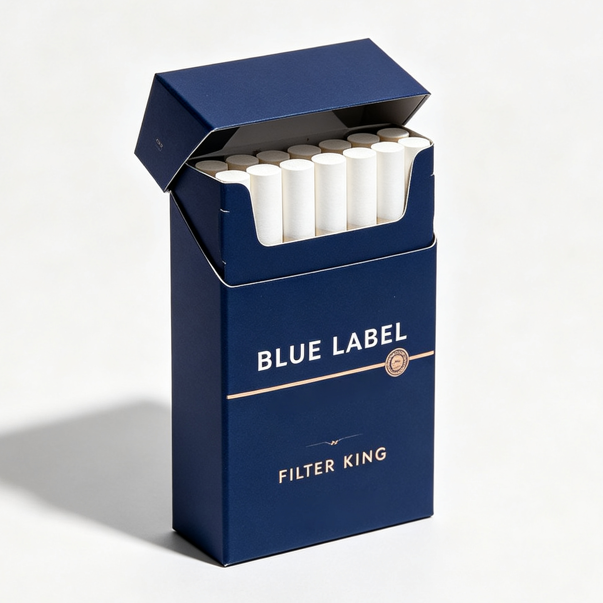
A simple printed box can look completely different after the right finishing process. Matte lamination gives the surface a softer, more understated appearance, while a glossy finish creates a brighter and more reflective look. Spot UV can be used to highlight selected parts of the design, such as a logo or brand name. Foil stamping can also add a premium visual effect when used carefully.
Think About Durability
Nobody wants a box that becomes damaged after being carried around for a short time. This is why material selection should consider more than appearance. The packaging should resist normal bending, scratching, and moisture exposure as much as reasonably possible. A slightly stronger material may be worthwhile if it helps the product maintain a neat appearance throughout its use.
Start With a Clear Brand Concept
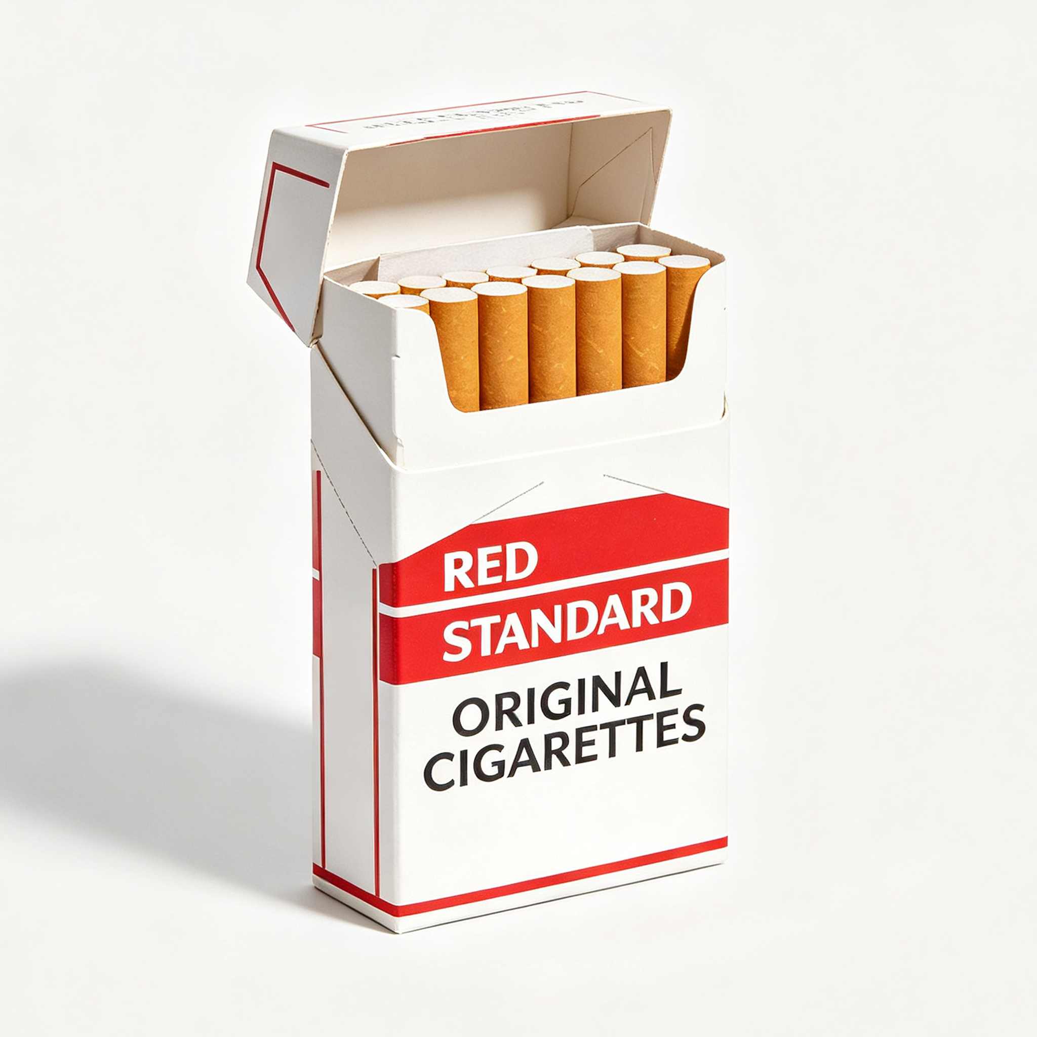
Before choosing colors or fonts, it helps to decide what the brand should feel like. Is it modern and minimal? Classic and sophisticated? Bold and energetic? Natural and understated? Having a clear direction makes the design process much easier. Otherwise, it is easy to add too many visual elements and end up with packaging that feels busy.
Use Color With a Purpose
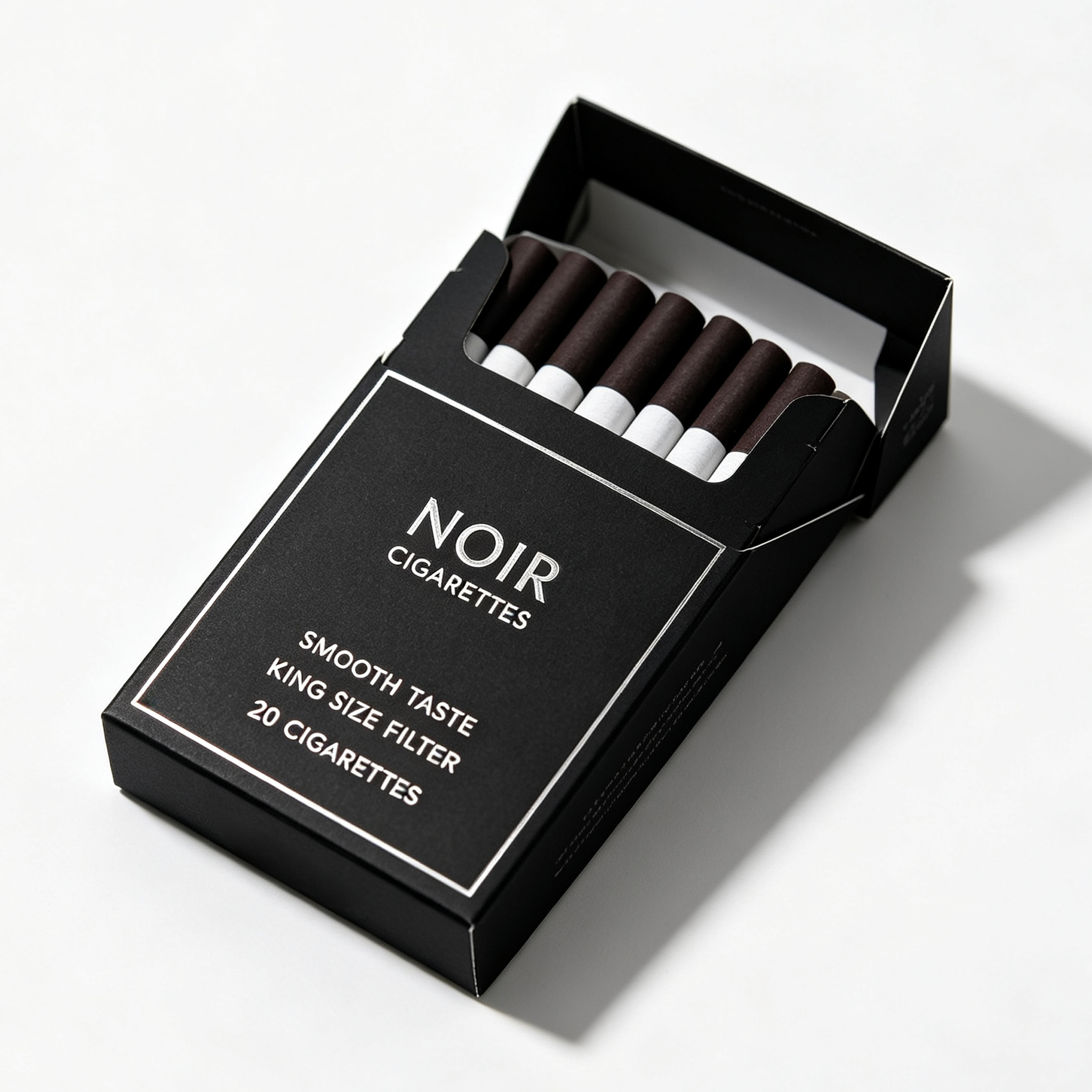
Color is one of the quickest ways to create recognition. A dark palette may suggest a more serious or premium image, while lighter colors can create a cleaner and simpler impression. Bright colors can make a package more noticeable, but they should still fit the overall identity of the brand. The key is consistency. If the same visual language appears across packaging and other marketing materials, customers are more likely to remember it.
Typography Should Stay Easy to Read
Fancy fonts may look interesting on a design screen, but they do not always work well on real packaging. Brand names, product information, and required warnings need to remain clear and readable. A strong design usually combines one main typeface with a limited number of supporting styles. Keeping typography under control can make even a simple cigarette box look professional.
Prepare Artwork Correctly
A great idea can still produce a disappointing package if the artwork is not prepared properly. Before printing, designers should check dimensions, bleed areas, color settings, image resolution, text placement, and folding lines. It is also important to consider how the flat artwork will look after the package is folded and assembled.
Request a Physical Sample
Digital mockups are useful, but they cannot show everything. A physical sample gives the design team a chance to check the actual colors, material, texture, size, and structure. Sometimes a finish that looks perfect on a computer feels too strong in person. A sample can reveal these problems before a larger production run begins.
Keep Production Costs Under Control
Custom packaging does not automatically have to be expensive. Cost can often be managed through material selection, box structure, printing methods, order quantity, and finishing choices. Instead of adding every available feature, brands can focus their budget on the elements that matter most. For example, a simple box with excellent typography and one high-quality finish may look better than an overloaded design with several competing effects.
Minimal Design Is Still Relevant
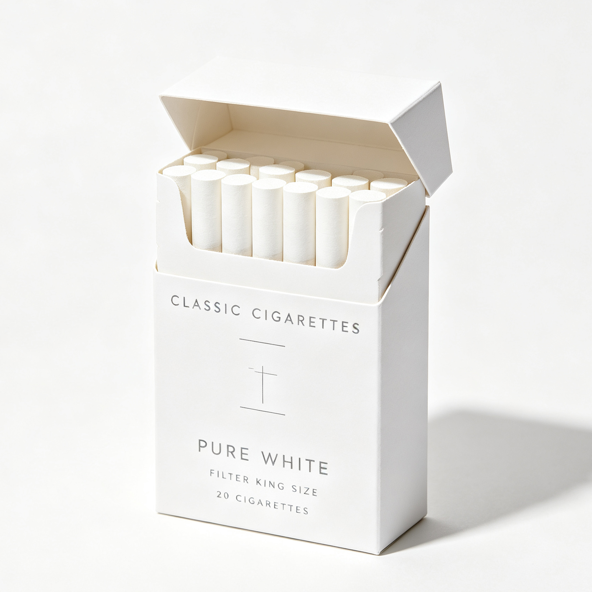
Clean packaging continues to attract attention because it is easy to understand at a glance. Simple layouts, controlled color palettes, and generous empty space can give a cigarette box a modern appearance. Minimalism does not mean boring. In fact, removing unnecessary elements often makes the important ones stand out more clearly.
Tactile Packaging Creates More Interaction
People do not experience packaging only with their eyes. Texture can also influence perception. Soft-touch coatings, embossing, textured paper, and other tactile finishes give customers something physical to notice. This can make the package feel more distinctive, particularly when competing products use similar visual styles.
Sustainability Is Becoming More Important
Packaging conversations are increasingly influenced by environmental concerns. Brands may want to explore materials and production methods that reduce unnecessary waste while still meeting functional requirements. Using an efficient structure, avoiding excessive packaging layers, and selecting suitable paper-based materials can all be considered during the design process.
Preparing the Artwork Correctly
Before a Cigarette box goes to print, the artwork normally needs to be checked for dimensions, bleed, safe areas, image resolution, and color settings.
Using the correct dieline is particularly important. A dieline shows where the package will be cut, folded, and glued. Artwork that crosses these areas without proper planning can result in unexpected alignment problems.
Understanding Printing Methods
Different printing processes can produce different visual results. Offset printing is often used when detailed graphics and consistent color reproduction are important. Digital printing may be more practical for certain short-run projects or prototypes.
The best method depends on order volume, artwork complexity, material, finishing requirements, and production specifications.
Proofing Before Mass Production
A digital proof is useful, but a physical sample can reveal issues that are difficult to see on screen. Folding, cutting, color appearance, and text positioning can all look different once the flat artwork becomes an actual package.
For that reason, reviewing a sample before large-scale production is a sensible part of the packaging workflow.
Focus on the Complete Experience
Creating a custom cigarette box is not simply a matter of choosing a nice color and printing a logo. Good packaging brings together design, materials, structure, printing, usability, and brand identity. Each part should support the same overall idea. When these elements are planned together, even a relatively simple package can have a strong visual presence.
Choose Quality Over Unnecessary Extras
There is no need to use every possible printing effect or finishing technique. A focused design with good materials and careful production can often create a better result. Start with the brand message, understand the audience, and then choose the packaging details that support that direction.
Build Recognition Over Time
The real value of custom packaging comes from consistency. When customers repeatedly see the same recognizable visual elements, the package becomes part of the brand itself. For companies developing or refreshing their packaging, a thoughtfully designed cigarette box can therefore serve as more than a container. It can become a practical part of the brand experience and help create a product identity that people can recognize at a glance.
Paperboard is one of the commonly considered materials for cigarette packaging because it is lightweight, printable, and suitable for folding structures. The ideal material depends on the required rigidity, printing method, finishing process, and regulations in the target market.
Yes. A custom Cigarette box can be developed around specific dimensions, structural requirements, artwork, typography, and finishing preferences. However, the final design should also account for production limitations and mandatory packaging information.
Before printing, check the dieline, package dimensions, bleed, safe areas, image resolution, color settings, and text placement. It is also a good idea to review a physical sample before starting mass production, as folding and cutting can affect the final appearance.
Depending on the packaging specifications, options may include matte or gloss finishes, coatings, embossing, and foil effects. These techniques can change the appearance and texture of the package, but they should be selected carefully to keep the design balanced and practical to produce.
Post time: Sep-12-2026