
Pre-roll packaging is more than a protective container. In a competitive retail environment, the package must present the brand, product information, required warnings, and key selling points in a limited amount of space. This makes pre-roll packaging labels an important part of the overall packaging strategy. A well-planned label can improve readability, strengthen brand recognition, and help consumers quickly understand what is inside the package.
Before creating artwork, packaging designers should identify every piece of information that must appear on the box or label. The available surface area should then be divided into logical zones for branding, product information, compliance content, and visual elements. This approach prevents important information from being crowded into a small corner or hidden by structural features.
For custom pre-roll packaging, space planning should begin with the actual box dimensions and dieline rather than a flat graphic alone. Well Paper Box offers custom sizes and shapes for pre-roll packaging, allowing brands to develop packaging around different product quantities and structures. Its product specifications also include custom printing, die cutting, scoring, gluing, and perforation, all of which can influence the final printable area.
A practical design starts by separating the package into primary, secondary, and functional information zones. The primary zone should immediately communicate the brand and product identity. Secondary areas can contain flavor, strain, quantity, or other product details. Functional areas can accommodate barcodes, batch information, legal text, and usage or storage information.
Protect Important Artwork From Folds, Seams, and Edges
One of the most common packaging design mistakes is treating the entire dieline as one continuous printable canvas. In reality, folds, glue flaps, perforations, windows, openings, and structural edges can affect how artwork appears after production.
When preparing pre-roll packaging labels, designers should establish a safe print area inside the dieline. Logos, product names, critical text, and regulatory information should not be positioned too close to cutting lines or folds. Bleed should also be included where required so that minor production tolerances do not create unwanted white edges.
The printable area should be considered panel by panel. For example, the front panel can carry the strongest branding, while the back panel can provide detailed product information. Side panels may be suitable for ingredients, directions, storage information, barcode placement, or company information.
Print technology also affects how designers use available space. Well Paper Box lists CMYK and PMS printing options and offers finishes such as gloss, matte, spot UV, gold foil, silver foil, embossing, and raised ink. These techniques can help create visual hierarchy without filling every available area with artwork.
A useful rule is to prioritize readability over decoration. Premium effects should highlight important brand elements rather than compete with mandatory information. A clean logo with selective foil or spot UV can often create a stronger visual impact than a package covered entirely with special effects.
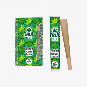
Make Essential Product Details Easy to Find
Retail packaging needs to communicate information quickly. Consumers and retail staff should be able to identify the product without searching through a crowded design. This is particularly important when multiple pre-roll products are displayed together.
A strong pre-roll packaging label system usually separates information into clear categories. These may include the brand name, product name, product type, quantity, flavor or variety, batch or lot information, barcode, manufacturer information, storage instructions, and applicable warnings. The exact requirements vary by product category and market, so brands should confirm current local regulations before final artwork approval.
Well Paper Box's pre-roll packaging materials emphasize that packaging can communicate product characteristics, usage information, ingredients, expiration information, and other essential details. Its custom pre-roll packaging pages also note the importance of product information and warning labels where required by applicable regulations.
Typography is especially important in this area. The most important information should have sufficient size, contrast, spacing, and visual separation. Avoid placing small text over complex backgrounds or decorative patterns. If a large amount of regulatory information is required, consider assigning a dedicated information panel instead of reducing the font size excessively.
Retail information should also be consistent across a product range. If a brand sells multiple varieties, the same information hierarchy can be repeated across different packages. This creates a recognizable packaging system while allowing colors, names, or graphics to distinguish individual products.
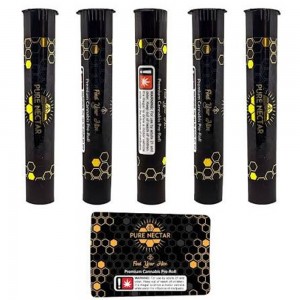
Design for Shelf Appeal Without Losing Function
The visual identity of pre-roll packaging has an important role in helping products stand out at retail. However, branding should work together with functional and regulatory information rather than compete with it.
A useful design hierarchy typically places the brand logo and product identity in the most visible area. Supporting information can follow underneath, while mandatory information is positioned in a clearly defined secondary area. This creates a natural reading path from brand recognition to product identification and finally to detailed information.
Custom finishing can reinforce this hierarchy. For example, embossing can emphasize a logo, while spot UV can highlight selected graphics. Foil stamping can be used for premium brand elements, and matte finishes can provide a contrasting surface for glossy details. Well Paper Box specifically offers these finishing options for custom pre-roll boxes.
At the same time, packaging should be designed around the final physical structure. A drawer-style box, for example, may have different front, side, and interior communication opportunities compared with a conventional folding carton. Well Paper Box offers drawer-style pre-roll packaging as well as other custom structures, demonstrating why label planning should begin with the packaging format itself.
For brands selling through retail channels, consistency is also valuable. A recognizable logo position, standardized product naming, and consistent information hierarchy can make an entire product family easier to identify.
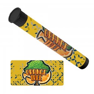
Check the Dieline Before Printing
Once the label layout is complete, the next step is proofing. This stage is critical because a design that looks correct on a computer screen may behave differently once it is folded, glued, cut, or assembled.
A production-ready file should be checked against the approved dieline. Designers should verify trim lines, bleed, fold lines, glue areas, perforations, windows, and the orientation of every panel. Text should be checked carefully for spelling, product details, barcodes, and required information.
Color preparation is equally important. CMYK artwork and PMS colors can produce different results depending on the printing process and substrate. Brands should therefore confirm their color specifications with the packaging manufacturer before production.
Well Paper Box states that its custom pre-roll packaging can be supplied with flat-view proofs, 3D mock-ups, and physical samples on request. These proofing methods can help brands review both the graphic design and physical structure before mass production.
A physical sample is particularly useful for checking label placement, readability, folding behavior, and the relationship between artwork and structural features. If a logo lands too close to an edge or important text becomes difficult to read after assembly, changes are much easier to make before full production.
Turn a Label Concept Into Retail-Ready Packaging
Successful pre-roll packaging labels require more than attractive artwork. The manufacturer must be able to translate the design into a functional package while maintaining print quality, structural accuracy, and consistent finishing.
When evaluating a packaging supplier, brands should consider customization capabilities, available materials, printing processes, finishing options, sampling procedures, quality control, and production capacity. These factors become especially important when packaging includes multiple panels, inserts, windows, special finishes, or child-resistant structures.
Well Paper Box identifies itself as a custom packaging manufacturer and provides pre-roll packaging in custom sizes and shapes. Its listed production capabilities include offset-style printing equipment, UV printing, automatic die cutting, folding, and gluing equipment. The company also describes quality and environmental management systems and lists certifications and material-related reports on its website.
For a packaging project, the best workflow is to provide the supplier with the product dimensions, required pack quantity, preferred material, dieline requirements, artwork, finishing specifications, and retail information at the beginning of the project. The manufacturer can then help determine whether the proposed design works with the selected structure and production process.
This collaborative approach can reduce revisions and help ensure that the final package looks consistent with the original concept. It also makes it easier to balance branding, print areas, structural requirements, and retail information within one coordinated design.
Create Packaging That Communicates Clearly at Retail
Effective pre-roll packaging labels are the result of strategic planning rather than simply adding more information to a box. Every panel should have a purpose, and the available print area should be organized around brand identity, product information, regulatory requirements, and retail usability.
Start with the dieline, define safe print areas, establish a clear information hierarchy, and keep important text away from folds, cuts, seams, and other structural elements. Use premium finishes selectively to strengthen branding while maintaining readability.
Finally, always proof the complete package before mass production. With custom sizes, multiple printing options, specialty finishes, and physical sampling available, packaging manufacturers such as Well Paper Box can support brands in developing pre-roll packaging that combines visual presentation with practical retail communication.
When space is limited, good label planning becomes especially important. A well-designed package does not simply contain a pre-roll—it organizes information, communicates the brand, supports retail presentation, and creates a consistent experience from the shelf to the consumer.
Pre-roll packaging labels typically include the brand name, product name, quantity, product details, barcode, batch or lot information, manufacturer information, storage instructions, and applicable warning or regulatory information. Exact requirements vary by market and product category.
Start with the packaging dieline and divide each panel into branding, product information, and required retail information areas. Keep important text and logos away from folds, cuts, glue flaps, perforations, and edges, while allowing sufficient bleed for production.
Yes. Custom pre-roll packaging can incorporate finishes such as spot UV, foil stamping, embossing, raised ink, matte, or gloss effects. These finishes can emphasize logos and important design elements while creating a more distinctive retail appearance.
Proofing helps confirm that artwork, text, colors, barcodes, folds, cuts, and structural elements work correctly before mass production. A physical sample can also reveal issues that may not be obvious when reviewing a flat digital design.
Post time: Sep-22-2026